An Architectural Photographer walks into a parking garage in Miami and…
Parking garages are often nothing more than essential eyesores. We Americans love our cars, and you can pry them from our cold, dead fingers. But they are heavy, so garages need to be strong enough to hold hundreds, sometimes thousands of them, hence why they’re ugly and thick with opaque, barren facades barricading the shame of what they hold inside. They are the architectural equivalent of beasts of burden. Or as the New York Times more eloquently put it: "The Grim Afterthought of American Design.”
But to its credit, Miami has done a solid job in the last 10 years or so of infusing civic projects with beauty. Museum Garage in the design district, the FPL Substation in downtown, and The Wynwood Garage are a few examples proving you don’t have to compromise aesthetics for function. We also have the war of the terminals at Port Miami as Royal Caribbean, Norwegian Cruise Lines, and Virgin Cruises breathe fresh life into traditionally underwhelming buildings that otherwise exist to shuffle humans around like cattle. It’s great to see the city’s vanity being put to good use.
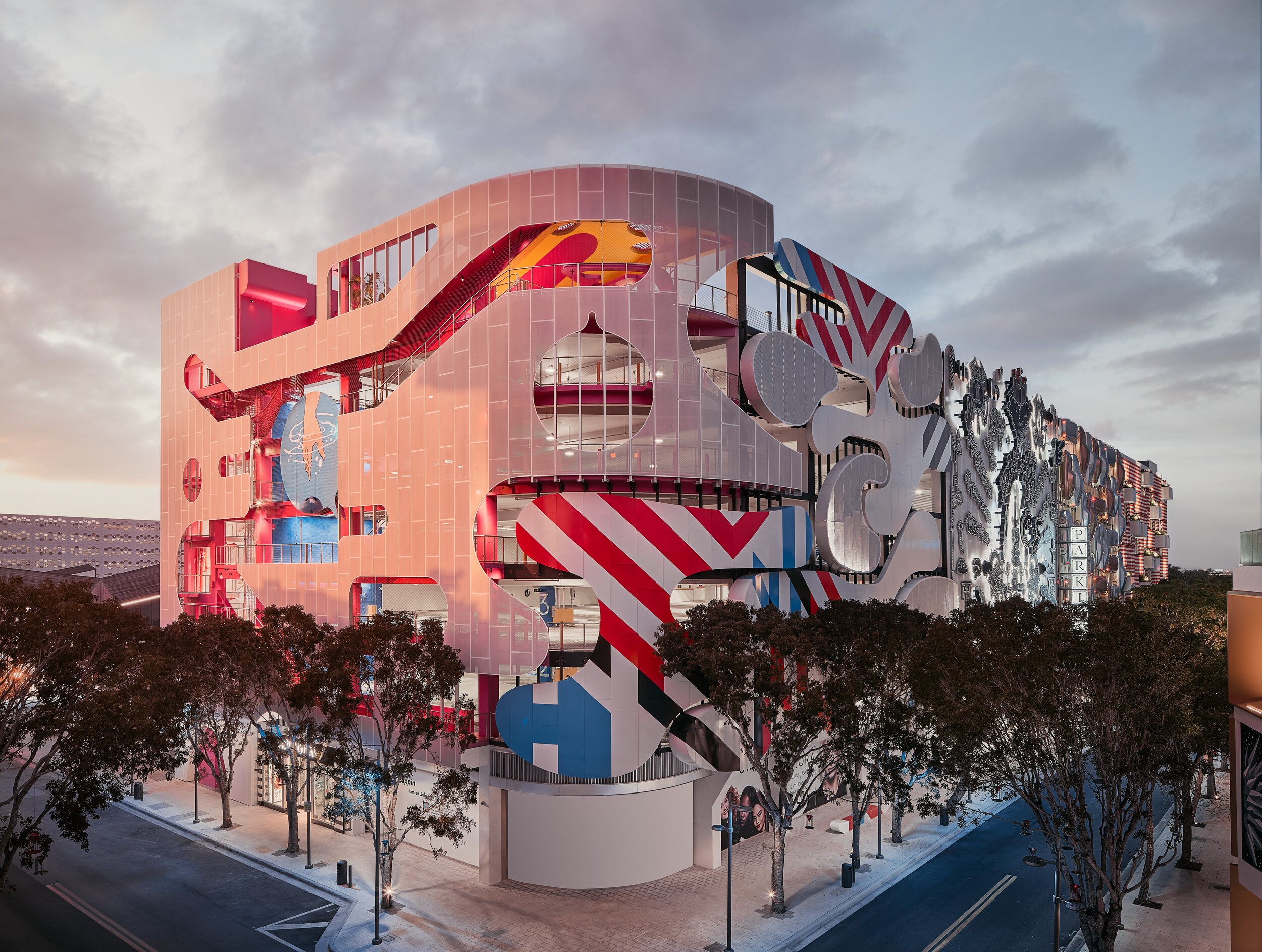
Museum Garage in Miami’s Design District is a more recent example of Parking Garages done right, but even here the decorative facade shields the public from confronting the stack of cars inside in contrast to the much bolder design at 1111 Lincoln road which makes no apologies for its content.
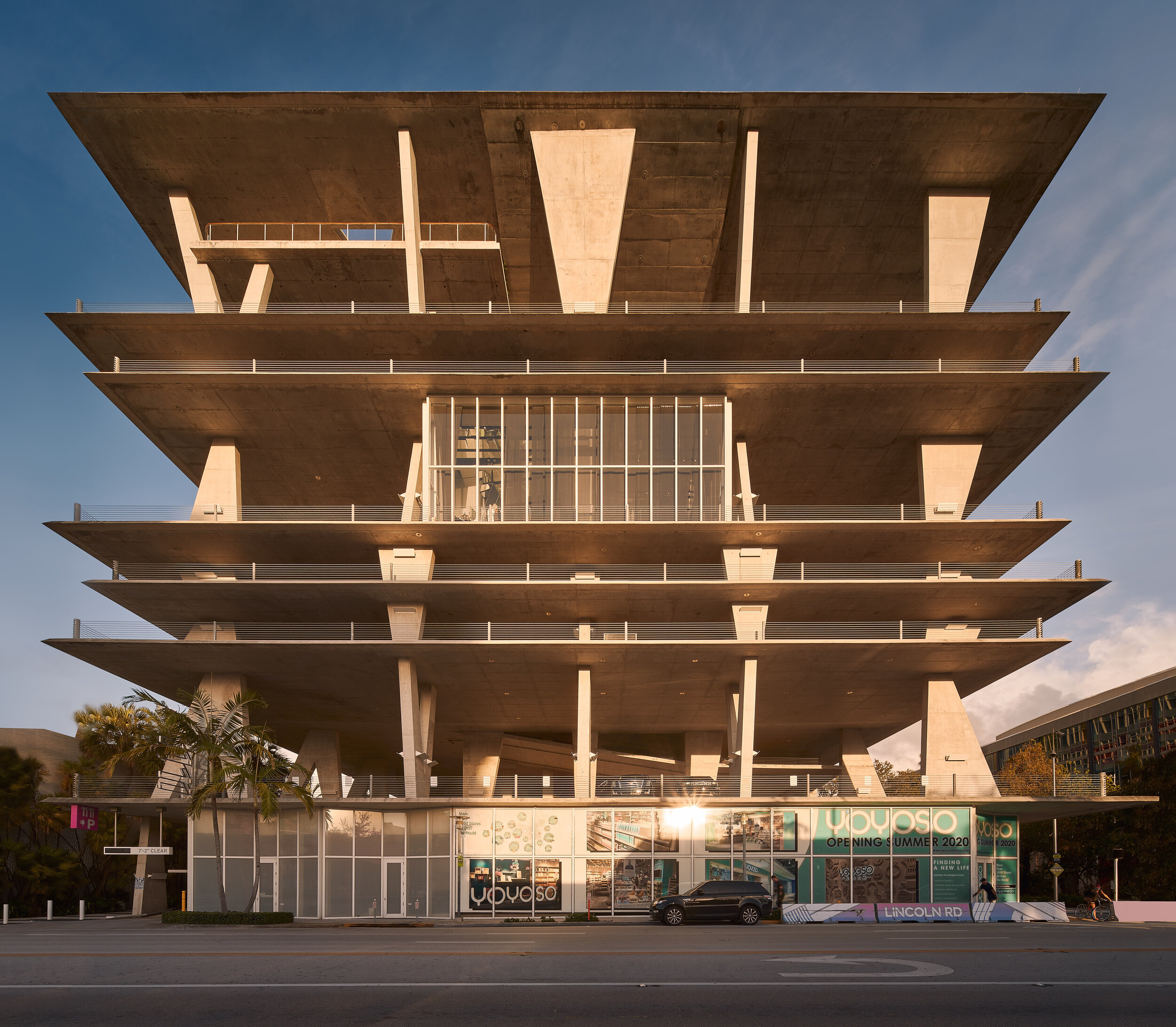
1111 Lincoln Road is one of the earliest contributions to Miami’s recent surge in cultural relevance. It was built in 2010 and designed by renowned architects at Herzog & De Meuron with landscape architecture provided by Raymond Jungles with the intention to revitalize the western part of Miami Beach’s historic Lincoln Road as a hub for retail and office space.
It defies the traditional definitions of parking structures by unapologetically shedding its walls and dissolving the barriers between the interior and exterior providing an open-air experience and featuring floor heights that range from 8 to 34 feet. The freedom of space is enhanced by the intentional use of thin, steel handrails instead of walls or thick barricades on the edges, which would have reduced the amount of open air. Cars have nothing but little bumpers on the floors to prevent them from getting too close to the edge. The building also runs contrary to the clandestine nature of most garages that try to limit public exposure to the stacks of cars that lie within. There are no apologies here. The building proudly displays its contents and dares you to say something about it. When you put it like that, Miami Beach feels like the perfect home for it.
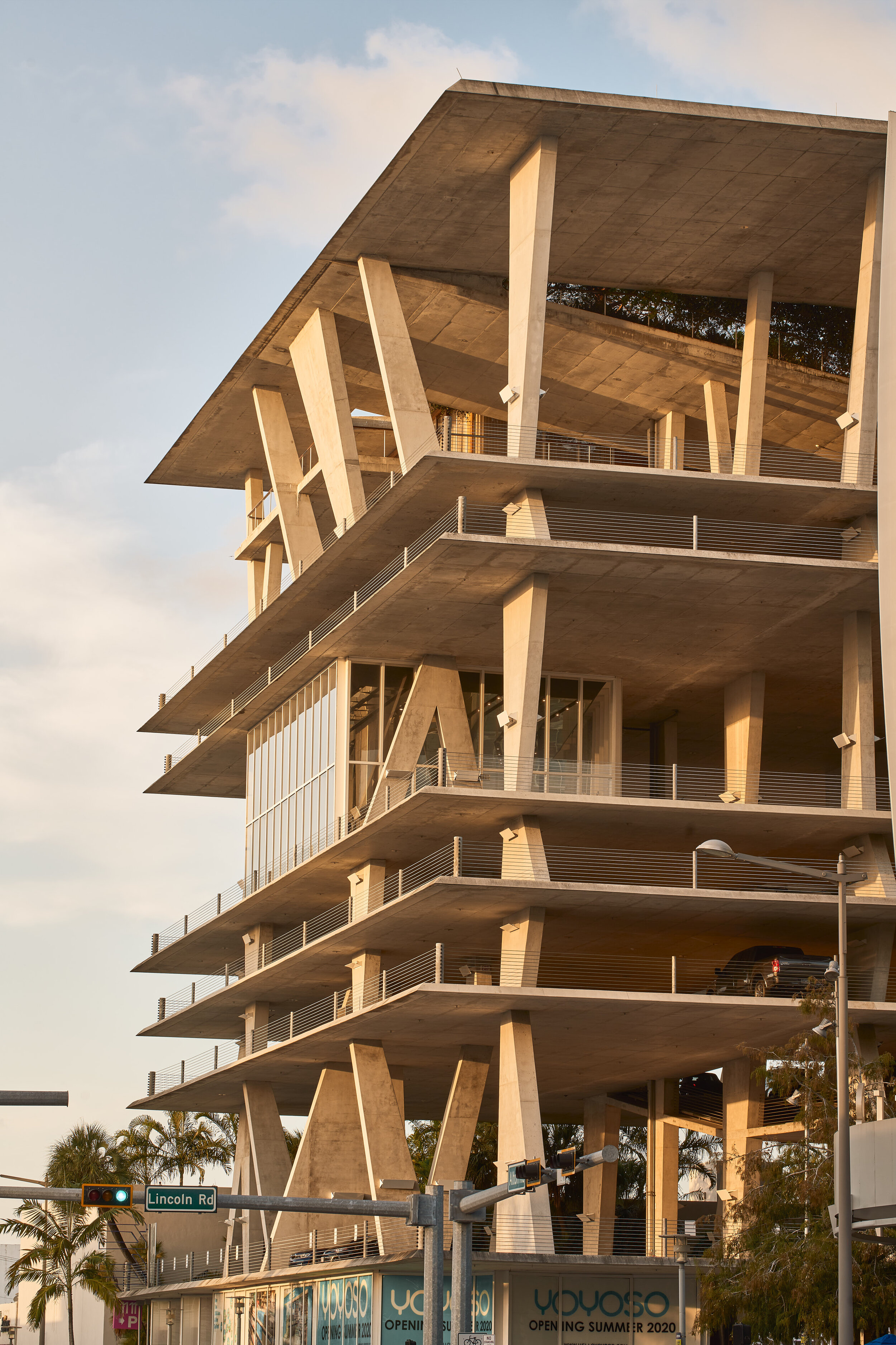
The design mimics a house of cards, one of the simplest, lightest, and transparent forms we can imagine. But this is no delicate structure. The majority of the construction materials are slabs of reinforced concrete traditionally used for such buildings. They’re constructed around buttresses and cantilevers.
A glass cube on the 5th floor houses some exclusive retail space.
The floors vary in height allowing for differences in the reflection of light, leaving some levels bright and airy and others dark and moody. As an architectural photographer, the former was greatly appreciated because it allowed me to maximize the dynamic range of the high contrast scene during the golden hour without having to resort to tedious luminosity masking in Photoshop. It was like shooting in a massive soft-box.
This discrepancy in lighting harmonizes the view from the outside as there are natural breaks in exposure between the floors with more pronounced shapes creating a balanced experience for the eye to wander through.
At some point, it started raining while the sun was still shining. In Spanish, we have a saying for this that defines such an event as a “witch is getting married.” But in this case, the real magic came from the ethereal, misty vibes mingling with the sharp lines and shadows. I was able to back up enough to use my 50mm Tilt-shift lens to shoot “wide” while still compressing the elements.
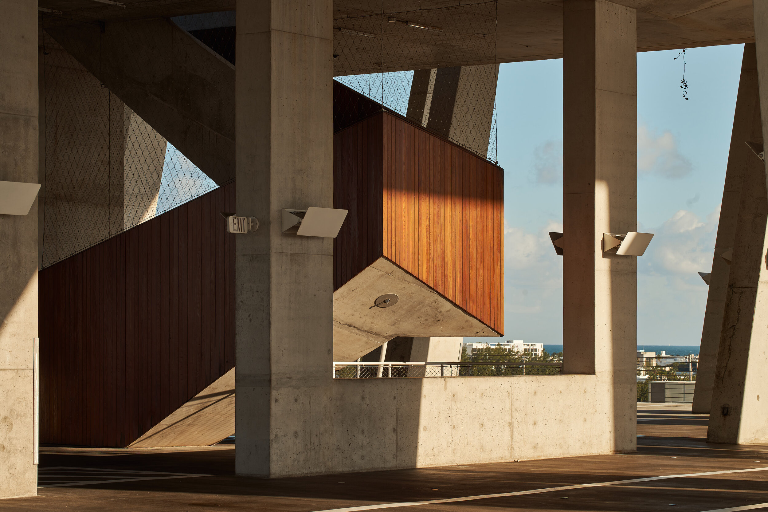
A private staircase leads to the rooftop penthouse residence. Yes did I mention this garage has a luxury condo? As the sun sets closer to the horizon, we’re greeted with warmer, richer tones that make that wood pop and contrast against the concrete.
The Canon 100mm macro lens got some love on this shoot too.
The Architects had more in mind…
I spent four wonderful days transitioning between jubilance and tranquility. Half the time I was sprinting up and down with the type of nervous energy you see in children at Disneyland. Except I was hopped up on chasing shadows and figures instead of sugar highs. The rest of the time I was at ease in the silence and solitude provided by Covid-19’s unfortunate devastation on the retail industry. I often had the space to myself. My mind is more Fred Flintstone rock quarry than Japanese tea ceremony, so I found myself taking long breaks between shots to make the most of such rare moments of quiet within. The incredible views of downtown and the beach don’t hurt either.
Anyone who has ever tried to park in this garage would wonder if that’s its primary purpose. With such expensive rates and other parking options nearby, it’s probably more of a status symbol than a practical parking space. The open-air concept doesn’t provide much protection from the elements either as there is plenty of space for the Atlantic winds to fire away with pellets of rainwater during storms. And for such a large structure, its capacity is limited to 300 cars.
Its role as the neighborhood temple takes priority over its function as a car lot. It is often the site of many local gatherings, as well as, a place of respite for anyone who wants to get away from the stark raving madness often found on Miami Beach.
Floors 5 and 7 have massive ceilings that welcome refreshing coastal breezes and spectacular sunset views. They often close them off entirely for a variety of events including movie premieres, fashion shows, and weddings. They even have yoga classes every Thursday, and on any given day you’ll find an assortment of humans engaged in fitness classes or impromptu photo sessions. A glass cube on the 5th floor houses some retail space currently occupied by a clothing boutique. I chose to not shoot it because it’s currently closed and a bit desolate. I did not wish to harm the brand’s image by having such depressing photos out in the world.
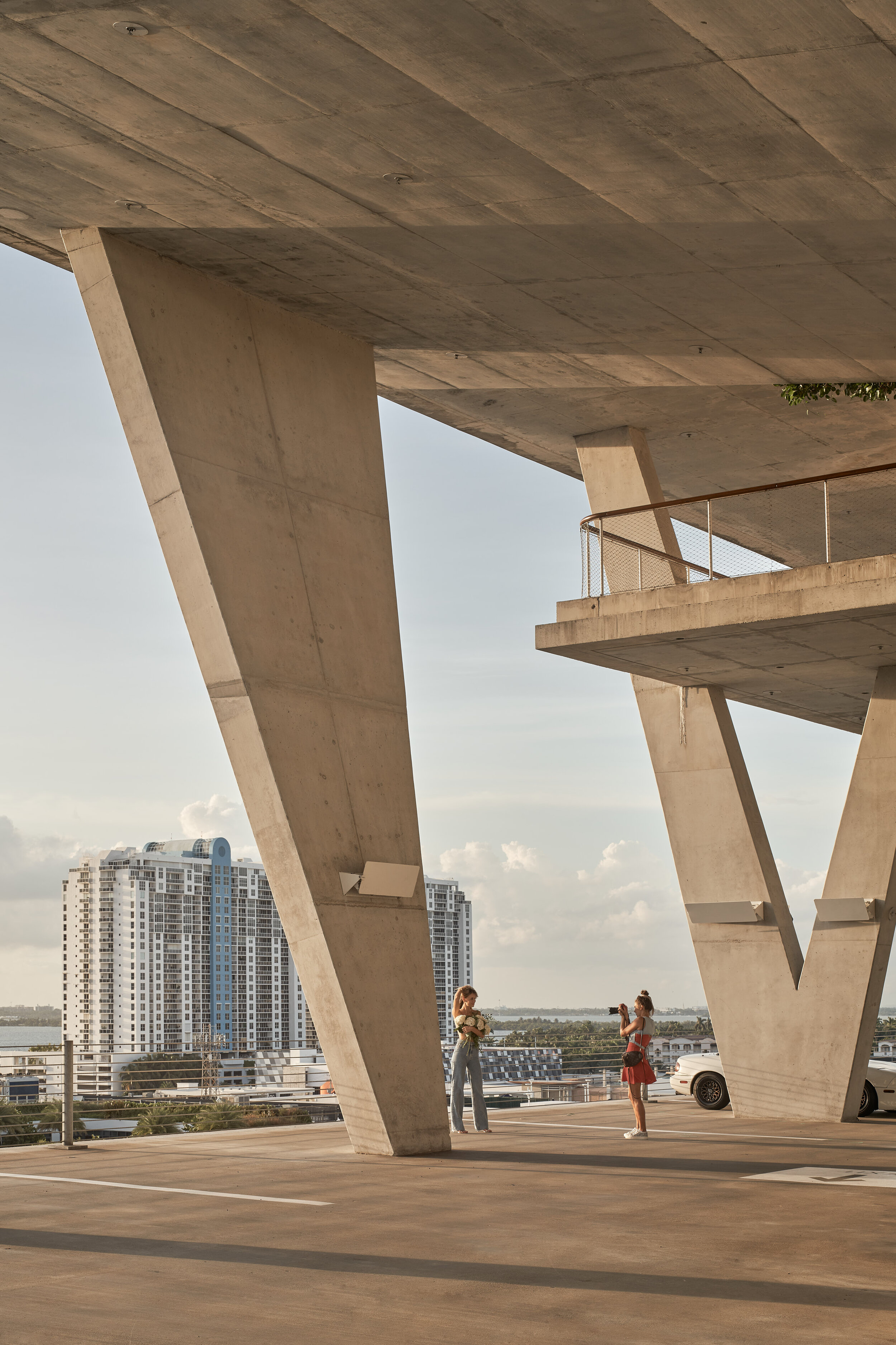
These random encounters allowed for some voyeuristic, photojournalist inclusions in the architectural photos. Human elements are a wonderful way to add a sense of scale to a space. This was helpful for conveying the height of the 34-foot ceilings on the 7th floor. With the right pictures, you can forgo copy altogether. But without text, I get no SEO benefits, so you’re stuck with my bloviating. Otherwise, this page would be nothing but a gallery of images that I hope can speak for themselves.
My absolute favorite part of this little project was the opportunity to use longer focal lengths. Any reason to use my 50mm tilt-shift lens is worth getting out of bed. My will very explicitly states that I am to be buried with it. The sheer size of the space presented some rare opportunities for me to bust out the 100mm macro lens as well. Architectural photography is done at the mercy of the limitations of the spaces we shoot. We often have no choice but to go with wider focal lengths. And don’t’ get me wrong, I think the 24mm Tilt-shift is the gold-standard. You really can’t go wrong with it. It’s been my most profitable lens to date and the one I’d recommend as the priority for anyone who wants to get into photographing buildings and interiors. But nothing gets me going like a “wide” shot with the compression from longer lenses.
It’s very rare that I get an entire space of this caliber to myself without the pressure of deadlines, schedules, and shot lists. I can’t articulate enough how wonderful it was to just wander at my own pace while being guided by the light. Miami can be such a tough place for architectural photography because it takes itself so damn seriously. People here have little imagination and often react to tripods and cameras with hysteria. It’s a guaranteed way to invite an overreaction by the roided out meat-heads who tend to work security. Most of the buildings I shoot here lend themselves to no more than one or two shots from accessible street levels (and the occasional trespass) with the rest of the compositions tucked away in a vault guarded by the concept of “private property.” You’d be surprised at how much “private” property is disguised as public. I hate that shooting 1111 Lincoln Road only recently occurred to me! It’s my own little architectural safe space, discovered just in time for me to move to Los Angeles. But more on that later. In the meantime, I think I’ll come back here often while I am still around if only to crack open a beer and watch the sunset.
The woman in the foreground lends the space a sense of scale by giving the viewer a constant variable with which to compare the size of the columns with.
Notice how the smaller floors provide a brief visual break as your eye scans the scene up and down?
Another excuse to use my 50mm Tilt-Shift lens which allows me to shift up and get a much taller portrait perspective while retaining background compression and providing a “normal” field of view closer to what the human eye perceives.
Instagram approved set-ups included with the price of a parking ticket.
How many moods can one space evoke?
At night, the garage is engulfed in a warm embrace of light as it guards the western entrance to the shops of Lincoln road. Tourists entering for the first time are instantly aware that this is no ordinary shopping experience. This is Miami. Everything is “extra.”
And here we have our interior hero shot at dusk. If I was a local, I’d probably come here daily just to watch the sunset over Biscayne Bay.

