Architecture Reflects A City’s Role
Miami, the sun-soaked den of vice and neon fever dreams, where the American Dream drowns booze, blow, fraud, and all manners of desperate ambition. A prop of a city where everything and everyone is for sale. You’ll never find a more wretched hive of tech bros, influencers, and only fans “entrepreneurs” uniting under palm trees that shade you from the sticker shock of fifty-dollar margaritas.
I have my beef with the city, but through the wisdom of years accept that we’re both to blame. We both wanted something different. But it’s home for better or worse. It’s where I was raised, and I am done with futile attempts to scrub it off like patches of dry skin.
I am grateful that it remains an architectural photographer’s playground.
This blog post will remain live and be frequently updated as I document all the Art Deco in South Florida. I’ll introduce juxtapositions to other flavors of the style and maintain it as a reference for those who share my curiosity and fascination for it.
Art Deco’s Origins
Art Deco originated in France slightly before World War One and exploded in popularity in America in the 20s and 30s after the 1925 Exposition Internationale des Arts Décoratifs et Industriels Modernes in Paris. The style became synonymous with glamour and progress and was characterized by its bold geometry, decadent materials, and detailing. Inspiration came from a variety of sources from Ancient Egypt to the opulence of the Roaring Twenties. Though short-lived, Art Deco's influence can be seen around the world from the skyscrapers of New York City to the pastel hues of Miami Beach, which harbors a deviation of the style known as "Streamline Moderne." More Subdued, grounded, and characterized by curved edges and nautical themes reflecting the city's coastal and tropical lifestyle.
Faded But Not Forgotten
Art Deco faded in popularity after World War 2 creating an appetite for the unadorned style of modern architecture prioritizing function over form, but its history is well preserved and appreciated to this day within one of my favorite childhood cartoons: Batman the Animated Series depicts Gotham City as a den of crime awash in silhouettes of Art Deco towers. The show features a dark, atmospheric blend of 1930s architectural grandeur and noir-infused modernism. The cityscape is dominated by towering skyscrapers with sharp, angular lines and geometric forms, reminiscent of iconic Art Deco structures like the Chrysler Building. These buildings often feature tiered, ziggurat-like designs, streamlined ornamentation, fluted columns, and a sense of verticality that emphasizes Gotham’s looming, almost oppressive skyline. It’s a brilliant visual motif that portrays the city as an empire in inevitable decay and juxtaposes nicely with Batman’s Quixotic quest to cleanse the crime that suffocates it. The city laughs, night after night, as Batman rolls his boulder of lunatics to the gates of Arkham, a revolving door that neither incarcerates nor rehabilitates, but gives Batman purpose for one more day.
Art Deco never looks out of place in a modern coastal city like Miami or a fictional comic book metropolis. That’s a testament to the forgiving timeless nature of the architectural genre. It’ll never feel “uncomfortable.”
Gotham’s architecture is a reflection of the city itself—grand, yet decaying, with a sense of faded glory and underlying menace. The massive, shadowy structures feel both futuristic and rooted in the past, evoking a time when industrial progress was celebrated, but now feels like a haunting relic in a city that has succumbed to darkness. This unique blend of Art Deco and noir elements gives Gotham City its iconic identity, serving as the perfect backdrop for the brooding world of Batman. Photo Credit: Batman The Animated Series.
A Wise Old Theater in Little Havana
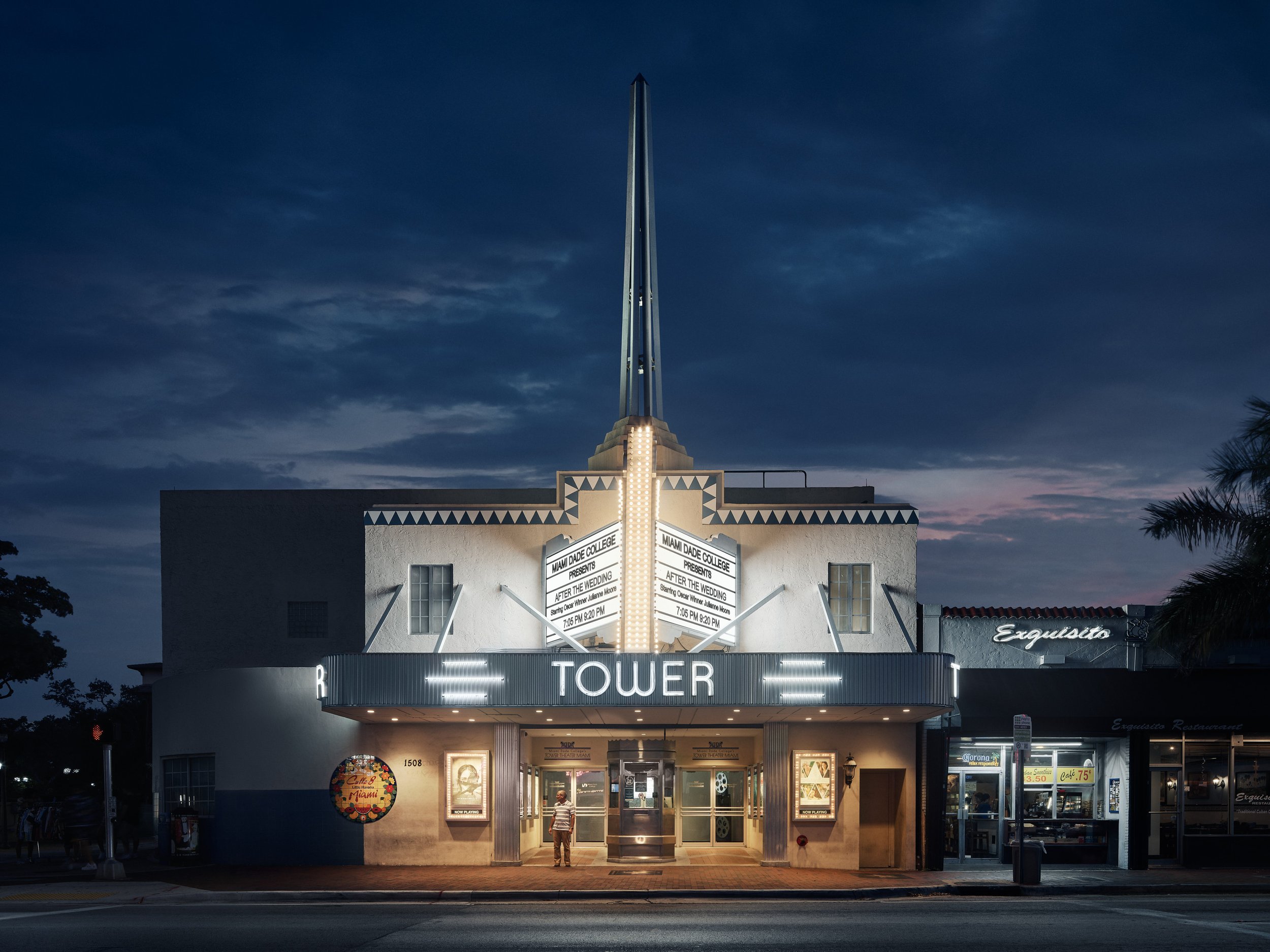
The Tower Theater features a clean, geometric façade with streamlined forms and symmetrical design elements, par for the course for Art Deco style. The central spire, rising boldly above the marquee, is the most prominent feature, evoking a sense of aspiration characteristic of the era's optimism.
Miami’s Iconic Art Deco Tower Theater illuminates the historic Calle Ocho district which has been a neighborhood staple for nearly a century. Given the city's insatiable appetite for replacing everything with luxury condos, I am pleased to have this memento to remember it buy if/when the day comes that they turn it into a Starbucks or Pilates studio.
My favorite memory of this photo is my friend Alex reacting to me angrily waiving off and "shoo-ing" away a car that parked in front of me after I had already locked my composition and was capturing my frames. Did he have the right of way? Yes. it was a legal parking spot. I didn't care. I knew I would leave with something I'd be proud of. For all my criticisms of the Magic City, my blood pumps with the best and worst of it. I am exhibit A in the cosmic prosecution of the whole damn racket. On cue, as a reward for my aggression, an older gentleman walks out of the theater wearing a striped shirt that perfectly aligns with the parallel handles of steel on the doors. You just can't plan for this. Everyone who’s anyone knows we architectural photographers are powerless to resist leading lines.
Across the street, right behind where my tripod was planted, is one Azucar, an anchor of the neighborhood for its unique, local flavors of Ice Cream beyond chocolate, vanilla, and strawberry. I mean, where else will you find flavors like “Abuela Maria?” The building’s facade features a massive Ice Cream cone topped with three flavors that rise in conjunction with the theater’s central spire like two friends having a low-stakes wager on who can climb higher. A contrast of old and new.
Ocean Drive: Preserving History
Another entry documenting Miami's historical architecture: The Bentley Hotel was originally known as "The Riviera Hotel" when it was first constructed in 1939. I present it to you with a chiaroscuro display of light as the sunrise creates long shadows from the palm trees dotting the sidewalks of Ocean Drive. Or what the Japanese would refer to as Komorebi. The morning cyclists add a sense of scale and life to the scene while a hotel guest on the top floor admires the best view in the house: The sun rising over the ocean.
It had an interesting role in the 40s during World War 2 when it was taken over by the US Army to house military personnel as part of some training efforts in Miami.
The hotel is a beautiful example of streamlined modernist architecture that incorporates elements of Art Deco. The building’s sleek and rounded corners give it a nautical feel, often referred to as "ocean liner" architecture, which was a hallmark of the Art Deco style in Miami during the 1930s. Its horizontal lines, created by the white concrete bands running along the façade, emphasize the building's low, sweeping structure, echoing the aerodynamic aesthetics that influenced many structures of the time.
The simple, geometric window designs are evenly spaced and reflect the clean, unadorned approach to the discipline. They also enhance the sense of “openness” and light inside.
The roof deck and subtle parapet walls crown the building, maintaining a sense of proportion and balance. The hotel's façade is minimal in terms of ornamentation, focusing instead on smooth surfaces and subtle detailing, which enhances its timeless elegance. The rounded corners, low profile, and white exterior are distinctly Miami Beach, blending seamlessly with the tropical environment and embodying the luxurious yet relaxed spirit of the city.
Getting this shot was more complicated than it might appear. Architectural photography is slow. It rewards patience and intentionality but occasionally requires a quick trigger based on instinct. The two go hand in hand. Tripods, geared heads, and manual focus Tilt-Shift lenses aren’t designed for fast reflexes. But the early morning sun waits for no man. The best light is short-lived, quickly turning from angelically soft to unforgivingly hard. You wait for that right balance of warmth, direction, and shadow density, and it doesn’t stick around, so when you have a whole street of buildings you want to shoot in the same light and don’t feel like coming back, you crack the whip. But it’s not just a matter of framing the shot and clicking the shutter. The human elements in the frame are crucial for that slice of humanity that can elevate an architectural photo. So you have to hurry yup and wait and don’t miss when the elements are lined up. Digital cameras with insane buffers make this task possible. I can’t imagine the pressure of doing it in the film days when you really had to make every shot count.
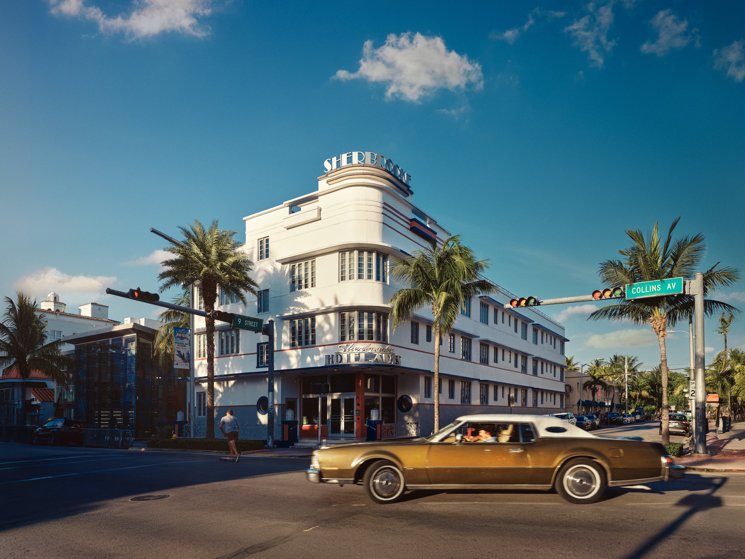
Vintage vibes are on display as a gold Lincoln Continental zips through the frame.
The Sherbrooke Hotel has had an interesting history, functioning as a hotel and a residential building throughout its life. Like many Art Deco buildings in Miami, it survived a period of decline before being part of the area's revitalization in the 1980s, when preservation efforts gained momentum. Today, the Sherbrooke stands as both a hotel and a piece of Miami Beach’s historical fabric, representing the resilience of the city’s architectural heritage.
The hotel's facade features clean lines, curved edges, a smooth stucco exterior, and corner windows that give it a sleek, aerodynamic appearance.
I can’t help but think of Jim Carey in his prime, bursting through the doors, eyes and tonguing popping out cartoonishly with a yellow suit and fedora. 1994’s The Mask features an art style heavily influenced by Art Deco, and I swear a building just like this was featured in the film. I could be wrong, but that’s still a testament to how much influence images have over our perception and how we remember things.
Remember before how I went on and on about the conflict of patience and speed in Architectural photography? Well this shot is an example of right place, right time, fast reflexes and a stroke of luck. I set the tripod down, framed the shot, got my focus, and was going to take a “test shot” when the Lincoln decided to photobomb me. I am here for the “happy accidents.”


